20";display:block;height:0;clear:both;visibility:hidden}.clearfix:before,.clearfix:after{content:' 20';display:block;overflow:hidden;visibility:hidden;width:0;height:0}.clearfix:after{clear:both}#Content .fixed-nav{display:none}.fixed-nav{position:fixed;bottom:40px;height:80px;z-index:90}.fixed-nav.fixed-nav-prev{left:0}.fixed-nav.fixed-nav-next{right:0}.fixed-nav .arrow{display:block;width:35px;height:80px;font-size:15px;position:relative;z-index:92;color:#fff;line-height:80px;text-align:center}.fixed-nav .photo{height:80px;width:80px;position:relative;z-index:92;overflow:hidden;line-height:0;background-color:#eee}.fixed-nav .desc{width:190px;padding:6px 15px;min-height:68px;background:#fff;z-index:91}.fixed-nav .desc h6{margin-bottom:0}.fixed-nav .desc i{display:inline-block;margin-right:2px}.fixed-nav .desc i:before{margin-left:0}.fixed-nav .desc .date{display:inline-block;width:100%;padding-top:3px;border-top-width:1px;border-top-style:solid}.fixed-nav-prev .arrow,.fixed-nav-prev .photo,.fixed-nav-prev .desc{float:left}.fixed-nav-prev .desc{margin-left:-335px}.fixed-nav-next .arrow,.fixed-nav-next .photo,.fixed-nav-next .desc{float:right}.fixed-nav-next .desc{margin-right:-335px}@media only screen and (max-width:1430px){.fixed-nav-prev .photo{position:static;margin-left:-115px}.fixed-nav-next .photo{position:static;margin-right:-115px}}#Header_wrapper{position:relative}body:not(.template-slider) #Header_wrapper{background-repeat:no-repeat;background-position:top center}#Header{position:relative}body:not(.template-slider) #Header{min-height:250px}#Header .container{padding-left:var(--mfn-column-gap-left);padding-right:var(--mfn-column-gap-right);box-sizing:border-box}#Top_bar{position:absolute;left:0;top:61px;width:100%;border-bottom:1px solid transparent;z-index:30}#Top_bar .column{display:flex;margin-bottom:0}#Top_bar .top_bar_left{position:relative;float:left;width:100%}#Top_bar .logo{float:left;margin:0 30px 0 20px}#Top_bar #logo{display:block;height:60px;line-height:60px;padding:15px 0;box-sizing:content-box}#Top_bar #logo img{vertical-align:middle;max-height:100%}#Top_bar #logo img.logo-sticky,#Top_bar #logo img.logo-mobile,#Top_bar #logo img.logo-mobile-sticky{display:none}#Top_bar .menu_wrapper{float:left;z-index:201}#Top_bar .secondary_menu_wrapper{display:none}#Top_bar a.responsive-menu-toggle{display:none;position:absolute;right:15px;top:50%;margin-top:-17px;width:34px;height:34px;text-align:center;border-radius:3px;z-index:200}#Top_bar a.responsive-menu-toggle i{font-size:22px;line-height:34px}#Top_bar .search_wrapper{position:absolute;left:50%;transform:translateX(-50%);top:calc(100% + 40px);display:none;z-index:205;width:100%;box-sizing:border-box;width:600px;max-width:80%;overflow:hidden}#Top_bar .search_wrapper>form{position:relative}#Top_bar .search_wrapper input[type=text]{width:100%;margin:0;box-sizing:border-box;-webkit-box-shadow:0 0 0;box-shadow:0 0 0;padding:22px 30px 22px 60px;background:0 0;border-width:0;font-size:15px;color:rgba(0,0,0,.8)}#Top_bar .search_wrapper .icon_search,#Top_bar .search_wrapper .icon_close{position:absolute;top:50%;transform:translateY(-50%)}#Top_bar .search_wrapper .icon_search{left:15px}#Top_bar .search_wrapper .icon_close{right:10px}#Top_bar .search_wrapper{background-color:#fff;box-shadow:0px 10px 46px 0px rgba(1,7,39,.1);border-radius:4px}#Top_bar #menu{z-index:201}#Top_bar .menu{z-index:202}#Top_bar .menu>li{margin:0;z-index:203;display:block;float:left}#Top_bar .menu>li:not(.mfn-megamenu-parent){position:relative}#Top_bar .menu>li>a{display:block;line-height:60px;padding:15px 0;position:relative}#Top_bar .menu>li>a:not(.menu-toggle):after{content:"";height:4px;width:100%;position:absolute;left:0;top:-4px;z-index:203;opacity:0}#Top_bar .menu>li>a span:not(.description){display:block;line-height:60px;padding:0 20px;white-space:nowrap;border-right-width:1px;border-style:solid}#Top_bar .menu>li:last-child>a span{border:0}#Top_bar .menu li ul{position:absolute;left:0;top:100%;z-index:205;margin:0;display:none;background-image:url(/wp-content/themes/betheme/images/box_shadow.png);background-repeat:repeat-x;background-position:left top}#Top_bar .menu li>ul{box-shadow:2px 2px 2px 0 rgba(0,0,0,.03);-webkit-box-shadow:2px 2px 2px 0 rgba(0,0,0,.03)}#Top_bar .menu li ul li{padding:0;width:200px;position:relative;font-weight:400}#Top_bar .menu li ul li a{padding:10px 20px;display:block;border-bottom:1px solid rgba(0,0,0,.05)}#Top_bar .menu li ul li a span{display:inline-block;position:relative}#body_overlay{position:fixed;top:0;left:0;width:100%;height:120%;background:rgba(0,0,0,.6);z-index:9002;display:none}body.mobile-side-slide{position:relative;overflow-x:visible}#Side_slide{display:block;position:fixed;top:0;right:-250px;max-width:100%;width:250px;height:100%;overflow:auto;border-bottom-width:60px;border-bottom-style:solid;z-index:99999;z-index:100000}#Side_slide.left{left:-250px;right:auto}#Side_slide .close-wrapper{height:60px}#Side_slide .close-wrapper a.close{height:34px;width:34px;display:block;float:right;margin:13px 13px 0 0}#Side_slide .close-wrapper a.close i{font-size:22px;line-height:34px}#Side_slide .extras{padding:0 20px}#Side_slide .extras .extras-wrapper{display:flex;align-items:center;flex-wrap:wrap;justify-content:center;margin-bottom:20px}#Side_slide .lang-wrapper{margin-bottom:20px;text-align:center;display:none}#Side_slide .social{text-align:center;margin:0 20px 13px}#Side_slide{background-color:#191919;border-color:#191919}#Side_slide,#Side_slide a:not(.action_button){color:#a6a6a6}#Subheader{background-color:rgba(0,0,0,.02);background-position:center top;background-repeat:no-repeat;padding:30px 0;position:relative}#Subheader .title{margin-bottom:0;width:70%;float:left}#Subheader:after{content:"";height:3px;width:100%;display:block;position:absolute;left:0;bottom:-3px;z-index:1;box-shadow:inset 0px 4px 3px -2px rgba(0,0,0,.06)}.subheader-both-center #Subheader .title{width:100%;text-align:center}.post-header{margin-bottom:20px}.post-header .title_wrapper{margin-left:99px;border-left-width:1px;border-style:solid;padding-left:30px}.post-header .title_wrapper h1{font-size:35px;line-height:35px}.single-photo-wrapper .image_frame{margin-left:120px}.share-simple .single-photo-wrapper .image_frame{margin-left:0}.single-photo-wrapper.image{text-align:center}.single-photo-wrapper.image .image_frame{margin-left:0;display:inline-block}.section-post-header .single-photo-wrapper.image .image_frame{max-width:80%;max-width:calc(100% - 130px)}.share-simple .section-post-header .single-photo-wrapper.image .image_frame{max-width:100%}.hide-love .button-love{display:none!important}.hide-love .post-header .title_wrapper{margin-left:0;padding-left:10px;border-left:none}.section-post-related .post-related .date_label{position:absolute;left:0;top:30px;z-index:20}.section-post-related .post-related hr{margin-left:30px;width:40%}.section-post-related .simple .post-related .date_label{margin-bottom:5px;position:static;padding:0;background-color:transparent;background-image:none}.section-post-related .simple .post-related .date_label:after{display:none}.section-post-related .simple .post-related hr{display:none}.share-simple .post-header .title_wrapper{margin-left:0;padding-left:0;border-left-width:0}.share-simple-wrapper .button-love{float:right}.mcb-sidebar{border-style:solid;padding:0 20px;position:relative}.mcb-sidebar:before{content:"";display:block;position:absolute;top:0;width:1500px;height:100%;background:rgba(0,0,0,.01);visibility:visible}.aside_left .mcb-sidebar{border-right-width:1px}.aside_left .mcb-sidebar:before{right:0}.mcb-sidebar.style-simple{border-color:transparent!important}.mcb-sidebar.style-simple:before{content:unset}.widget{margin:30px 0;position:relative}.widget:after{content:"";display:block;position:absolute;bottom:0;width:1500px;height:0;visibility:visible;border-width:1px 0 0;border-style:solid}.widget:not(.widget_block)>h3{font-size:18px;line-height:22px}.sidebar.has-lines .widget{padding-bottom:30px}.aside_left .widget:after{right:0}.widget_nav_menu ul{list-style-type:square;padding:5px 10px 5px 30px;background:rgba(0,0,0,.03)}.widget_nav_menu ul li{position:relative}.widget_nav_menu ul li:after{content:"";display:block;width:70px;border-width:0 0 1px;border-style:solid;border-color:rgba(0,0,0,.1);position:absolute;left:-30px;bottom:0}.widget_nav_menu ul li:last-child:after{display:none}.widget_nav_menu ul li a{display:block;padding:8px 0 9px 3px}.dark{color:#fff!important}.image_frame{display:block;overflow:hidden;margin:0;border-style:solid;border-width:0;max-width:100%;line-height:0;box-sizing:border-box}.image_frame .image_wrapper{box-sizing:border-box}.image_frame a{display:block}.image_frame .image_wrapper{position:relative;overflow:hidden}.image_frame .image_wrapper .mask{position:absolute;left:0;width:100%;height:100%;z-index:2}.image_frame .image_wrapper img:not(.ls-l){position:relative;top:0;-webkit-transform:scale(1);-moz-transform:scale(1);-o-transform:scale(1);transform:scale(1)}.image_frame .image_wrapper .mask:after{content:"";display:block;position:absolute;left:0;width:100%;height:100%;z-index:3;opacity:0}.image_frame .image_wrapper .image_links{display:flex;width:100%;height:60px;position:absolute;left:0;bottom:-60px;z-index:4;overflow:hidden}.image_frame .image_wrapper .image_links a{display:flex;justify-content:center;align-items:center;flex:1;position:relative;width:100%;border-style:solid;border-color:transparent}.image_frame .image_wrapper .image_links a svg{width:32px}.if-overlay .image_frame .image_wrapper .image_links{opacity:0;width:auto;height:auto;bottom:auto;top:50%;left:50%;z-index:4;transform:translate(-50%,-50%)}.if-overlay .image_frame .image_wrapper .image_links a{height:60px;width:60px}.if-overlay .image_frame:not(.no_link) .image_wrapper img:not(.ls-l){margin-bottom:0!important}.image_frame .image_wrapper .image_links a{background-color:#fff}.image_frame .image_wrapper .image_links a .path{stroke:#161922}.image_frame .image_wrapper .image_links a{box-shadow:inset -1px 0 0 0 rgba(0,0,0,0)}hr{display:block;border:none;outline:none;height:1px;width:100%;margin:0 auto 15px;clear:both}hr{margin:0 auto 15px;clear:both}form{margin-bottom:0}input[type=text]{padding:10px;outline:none;margin:0;width:230px;max-width:100%;display:block;margin-bottom:20px;font-size:15px;border-width:1px;border-style:solid;border-radius:0;box-sizing:border-box;-webkit-appearance:none}ul{list-style:none outside}.date_label{font-size:12px;line-height:18px;display:inline-block;padding:2px 5px;-webkit-border-radius:4px;border-radius:4px;background-image:url(/wp-content/themes/betheme/images/stripes/stripes_3_b.png)}.date_label:after{content:"";display:block;position:absolute;right:-5px;top:6px;width:0;height:0;border-style:solid;border-width:5.5px 0 5.5px 5px;border-color:transparent}.date_label{background-color:#f8f8f8;color:#a8a8a8}.date_label:after{border-left-color:#f8f8f8}input[type=text],.post-header .title_wrapper,.mcb-sidebar,.widget:after,.fixed-nav .desc .date{border-color:rgba(0,0,0,.08)}input[type=text]{background-color:#fff;color:#626262;box-shadow:inset 0 0 2px 2px rgba(0,0,0,.02)}hr{background-color:rgba(0,0,0,.08);color:rgba(0,0,0,.08)}#Top_bar .menu>li>a span{border-color:rgba(0,0,0,.05)}.image_frame{border-color:#f8f8f8}.image_frame .image_wrapper{border-color:#e2e2e2}.image_frame .image_wrapper .mask{box-shadow:inset 0 0 5px 2px rgba(0,0,0,.07)}.image_frame .image_wrapper .mask:after{background:rgba(0,0,0,.15)}.if-overlay .image_frame .image_wrapper .mask{box-shadow:inset 0 0 0 0 rgba(0,0,0,.0)}.mfn-close-icon{z-index:5;display:flex;justify-content:center;align-items:center;width:40px;height:40px;font-size:20px;text-decoration:none!important}.mfn-close-icon .icon{color:rgba(0,0,0,.3);display:inline-block}.section_wrapper{display:flex;align-items:flex-start;flex-wrap:wrap}body{--mfn-swiper-pagination-bullet-active-color:#007aff;--mfn-swiper-pagination-bullet-inactive-color:#000;--mfn-swiper-pagination-bullet-width:10px;--mfn-swiper-pagination-bullet-height:10px;--mfn-swiper-pagination-spacing:20px;--mfn-swiper-arrow-width:auto;--mfn-swiper-arrow-height:auto;--mfn-swiper-arrow-size:50px;--mfn-swiper-arrow-spacing:20px}body{--mfn-tabs-border-width:1px}html{overflow-x:hidden}@media only screen and (min-width:960px) and (max-width:1239px){body{min-width:0}#Wrapper{max-width:960px}.section_wrapper,.container,.with_aside .content_wrapper{max-width:940px}}@media only screen and (max-width:959px){.section{background-attachment:scroll!important}}@media only screen and (min-width:768px) and (max-width:959px){body{min-width:0}#Wrapper{max-width:728px}.section_wrapper,.container,.with_aside .content_wrapper{max-width:708px}#Subheader .title{width:100%}}@media only screen and (min-width:768px){.header-modern .header_placeholder{height:0!important}}@media only screen and (max-width:767px){body{min-width:0}body.responsive-overflow-x-mobile{overflow-x:hidden}.section_wrapper .column,.container .column{margin:0;width:100%;clear:both}.sections_group,.four.columns{margin:0;width:100%!important;clear:both}.content_wrapper .section_wrapper,.container,.four.columns .widget-area{max-width:700px!important}.with_aside .content_wrapper{max-width:100%}.content_wrapper .mcb-column-inner{margin:0 0 20px}.four.columns{margin:auto 0!important}.mcb-sidebar{padding:0;min-height:unset!important;border:0!important}.mcb-sidebar:after,.mcb-sidebar:before{display:none}.inner-wrapper-sticky{position:static!important;transform:none!important}.widget-area{height:auto!important;margin:0 auto 20px!important;box-sizing:content-box}.widget:after{width:100%}body:not(.mobile-sticky) .header_placeholder{height:0!important}#Top_bar{background-color:#fff!important;position:static}#Top_bar .container{max-width:100%!important;padding:0!important}#Top_bar .column{flex-wrap:wrap}#Top_bar .top_bar_left{float:none;width:100%!important;background:none!important}#Top_bar a.responsive-menu-toggle{top:40px;right:10px}#Top_bar .menu_wrapper{float:left!important;width:100%;margin:0!important}#Top_bar #menu{float:left;position:static!important;width:100%!important}#Top_bar .logo{position:static;float:left;width:100%;text-align:center;margin:0}#Top_bar .logo #logo{padding:0!important;margin:10px 50px}#Top_bar #logo img.logo-main{display:none}#Top_bar #logo img.logo-mobile{display:inline-block}#Top_bar #logo img.logo-mobile-sticky{display:none}#Top_bar .search_wrapper{z-index:10000}#Subheader .title{width:100%}.post-header .title_wrapper{margin-left:69px;padding-left:20px}.post-header .title_wrapper h1{font-size:27px;line-height:27px}.single-photo-wrapper .image_frame{max-width:100%!important;margin-left:0}.image_frame{margin-top:0!important}.fixed-nav{display:none!important}}body:not(.template-slider) #Header_wrapper{background-image:url(https://www.deadseainfo.co.il/wp-content/uploads/2022/02/-e1643804098587.jpg);background-repeat:no-repeat;background-position:center;background-size:cover}html{background-color:#fff}#Wrapper,#Content,#Top_bar .search_wrapper{background-color:#fcfcfc}body:not(.template-slider) #Header{min-height:0px}#Subheader{padding:190px 0 100px}body,input[type=submit],input[type=text]{font-family:"Assistant",-apple-system,BlinkMacSystemFont,"Segoe UI",Roboto,Oxygen-Sans,Ubuntu,Cantarell,"Helvetica Neue",sans-serif}#menu>ul>li>a{font-family:"Assistant",-apple-system,BlinkMacSystemFont,"Segoe UI",Roboto,Oxygen-Sans,Ubuntu,Cantarell,"Helvetica Neue",sans-serif}#Subheader .title{font-family:"Assistant",-apple-system,BlinkMacSystemFont,"Segoe UI",Roboto,Oxygen-Sans,Ubuntu,Cantarell,"Helvetica Neue",sans-serif}h1,h3{font-family:"Assistant",-apple-system,BlinkMacSystemFont,"Segoe UI",Roboto,Oxygen-Sans,Ubuntu,Cantarell,"Helvetica Neue",sans-serif}h6{font-family:"Assistant",-apple-system,BlinkMacSystemFont,"Segoe UI",Roboto,Oxygen-Sans,Ubuntu,Cantarell,"Helvetica Neue",sans-serif}body{font-size:16px;line-height:21px;font-weight:400;letter-spacing:0px}#menu>ul>li>a{font-size:18px;font-weight:400;letter-spacing:0px}#Subheader .title{font-size:60px;line-height:60px;font-weight:400;letter-spacing:0px}h1{font-size:25px;line-height:25px;font-weight:300;letter-spacing:0px}h3{font-size:30px;line-height:32px;font-weight:400;letter-spacing:0px}h6{font-size:14px;line-height:19px;font-weight:400;letter-spacing:0px}@media only screen and (min-width:768px) and (max-width:959px){body{font-size:14px;line-height:19px;font-weight:400;letter-spacing:0px}#menu>ul>li>a{font-size:15px;font-weight:400;letter-spacing:0px}#Subheader .title{font-size:51px;line-height:51px;font-weight:400;letter-spacing:0px}h1{font-size:21px;line-height:21px;font-weight:300;letter-spacing:0px}h3{font-size:26px;line-height:27px;font-weight:400;letter-spacing:0px}h6{font-size:13px;line-height:19px;font-weight:400;letter-spacing:0px}.widget>h3{font-size:17px;line-height:20px}}@media only screen and (min-width:480px) and (max-width:767px){body{font-size:13px;line-height:19px;font-weight:400;letter-spacing:0px}#menu>ul>li>a{font-size:14px;font-weight:400;letter-spacing:0px}#Subheader .title{font-size:45px;line-height:45px;font-weight:400;letter-spacing:0px}h1{font-size:19px;line-height:19px;font-weight:300;letter-spacing:0px}h3{font-size:23px;line-height:24px;font-weight:400;letter-spacing:0px}h6{font-size:13px;line-height:19px;font-weight:400;letter-spacing:0px}.widget>h3{font-size:16px;line-height:19px}}@media only screen and (max-width:479px){body{font-size:13px;line-height:19px;font-weight:400;letter-spacing:0px}#menu>ul>li>a{font-size:13px;font-weight:400;letter-spacing:0px}#Subheader .title{font-size:36px;line-height:36px;font-weight:400;letter-spacing:0px}h1{font-size:15px;line-height:19px;font-weight:300;letter-spacing:0px}h3{font-size:18px;line-height:19px;font-weight:400;letter-spacing:0px}h6{font-size:13px;line-height:19px;font-weight:400;letter-spacing:0px}.widget>h3{font-size:15px;line-height:18px}}.with_aside .sidebar.columns{width:25%}.with_aside .sections_group{width:75%}@media only screen and (min-width:1240px){#Wrapper,.with_aside .content_wrapper{max-width:1280px}.section_wrapper,.container{max-width:1260px}}@media only screen and (max-width:767px){#Wrapper{max-width:calc(100% - 67px)}.content_wrapper .section_wrapper,.container,.four.columns .widget-area{max-width:550px!important;padding-left:33px;padding-right:33px}}.button-flat input[type=submit]{color:#fff}#Top_bar #logo{height:60px;line-height:60px;padding:15px 0}#Top_bar .menu>li>a{padding:15px 0}.image_frame{border-width:0}#Side_slide{right:-250px;width:250px}#Side_slide.left{left:-250px}@media only screen and (min-width:1240px){body:not(.header-simple) #Top_bar #menu{display:block!important}.menuo-no-borders #Top_bar .menu>li>a span{border-width:0!important}}@media only screen and (min-width:768px) and (max-width:1240px){.header_placeholder{height:0!important}}@media only screen and (max-width:1239px){#Top_bar #menu{display:none;height:auto;width:300px;bottom:auto;top:100%;right:1px;position:absolute;margin:0}#Top_bar a.responsive-menu-toggle{display:block}#Top_bar #menu>ul{width:100%;float:left}#Top_bar #menu ul li{width:100%;padding-bottom:0;border-right:0;position:relative}#Top_bar #menu ul li a{padding:0 25px;margin:0;display:block;height:auto;line-height:normal;border:none}#Top_bar #menu ul li a:not(.menu-toggle):after{display:none}#Top_bar #menu ul li a span{border:none;line-height:44px;display:inline;padding:0}#Top_bar #menu ul li a span:after{display:none!important}#Top_bar #menu ul li ul{position:relative!important;left:0!important;top:0;padding:0;margin-left:0!important;width:auto!important;background-image:none!important;box-shadow:0 0 0 0 transparent!important;-webkit-box-shadow:0 0 0 0 transparent!important}#Top_bar #menu ul li ul li{width:100%!important}#Top_bar #menu ul li ul li a{padding:0 20px 0 35px}#Top_bar #menu ul li ul li a span{padding:0}#Top_bar #menu ul li ul li a span:after{display:none!important}.rtl #Top_bar #menu{left:1px;right:auto}.rtl #Top_bar a.responsive-menu-toggle{left:20px;right:auto}.rtl #Top_bar #menu ul li ul{left:auto!important;right:0!important}.rtl #Top_bar #menu ul li ul li a{padding:0 30px 0 20px}}body{--mfn-clients-tiles-hover:#baaa70;--mfn-icon-box-icon:#baaa70;--mfn-sliding-box-bg:#baaa70;--mfn-woo-body-color:#000;--mfn-woo-heading-color:#000;--mfn-woo-themecolor:#baaa70;--mfn-woo-bg-themecolor:#baaa70;--mfn-woo-border-themecolor:#baaa70}#Header_wrapper{background-color:#c1b6a6}#Subheader{background-color:rgba(247,247,247,1)}body{color:#000}.widget_nav_menu ul{color:#baaa70}.fixed-nav .arrow{background-color:#baaa70}a{color:#baaa70}.fixed-nav .desc .date{color:#a8a8a8}h1{color:#0c1c1f}h3{color:#0c1c1f}h6{color:#0c1c1f}.button-flat input[type=submit]{background-color:#baaa70}hr.hr_color{color:#baaa70;background:#baaa70}#Header .top_bar_left,#Top_bar #menu{background-color:#fff}#Top_bar .menu>li>a{color:#000}#Top_bar .menu>li a:not(.menu-toggle):after{background:#000}#Top_bar .menu>li ul{background-color:#f2f2f2}#Top_bar .menu>li ul li a{color:#5f5f5f}#Top_bar .responsive-menu-toggle{color:#000;background:0 0}#Side_slide{background-color:#191919;border-color:#191919}#Side_slide,#Side_slide a:not(.action_button){color:#a6a6a6}#Subheader .title{color:#000}.image_frame .image_wrapper .image_links a{background:#fff;color:#161922;border-color:#fff}.image_frame .image_wrapper .image_links a .path{stroke:#161922}.image_frame{border-color:#f8f8f8}.image_frame .image_wrapper .mask:after{background:rgba(0,0,0,.15)}input[type=text]{color:#626262;background-color:rgba(255,255,255,1);border-color:#ebebeb}::-webkit-input-placeholder{color:#929292}::-moz-placeholder{color:#929292}:-ms-input-placeholder{color:#929292}:focus::-webkit-input-placeholder{color:#929292}:focus::-moz-placeholder{color:#929292}@media only screen and (max-width:767px){#Top_bar{background-color:#fff!important}}form input.display-none{display:none!important}body{--mfn-featured-image:url(https://www.deadseainfo.co.il/wp-content/uploads/2013/11/hd-wallpaper-g74ba4ac24_1280.jpg)}@media screen{body{direction:rtl;unicode-bidi:embed}.column,.columns{float:right}input[type=submit]{margin-left:7px;margin-right:0}.fixed-nav.fixed-nav-prev{left:auto;right:0}.fixed-nav.fixed-nav-next{left:0;right:auto}.fixed-nav-prev .arrow,.fixed-nav-prev .photo,.fixed-nav-prev .desc{float:right}.fixed-nav-prev .desc{margin-left:0;margin-right:-335px}.fixed-nav-next .arrow,.fixed-nav-next .photo,.fixed-nav-next .desc{float:left}.fixed-nav-next .desc{margin-left:-335px;margin-right:0}.fixed-nav .desc i{margin-left:2px;margin-right:0}.fixed-nav .desc i:before{margin-right:0;margin-left:.2em}.fixed-nav-prev .arrow i:before{content:'\e916'}.fixed-nav-next .arrow i:before{content:'\e8b8'}#Top_bar .logo{float:right;margin:0 20px 0 30px}#Top_bar .top_bar_left{float:right}#Top_bar .menu_wrapper{float:right}#Top_bar .menu>li{float:right}#Top_bar .menu>li>a span{border-left-width:1px;border-right-width:0}#Top_bar .menu>li>a span:not(.description){border-left-width:1px;border-right-width:0}#Top_bar .menu>li:last-child>a span{border-right-width:1px solid rgba(0,0,0,.05)}#Top_bar .menu>li:first-child>a span{border-right-width:0}#Top_bar .menu li ul{left:auto;right:0}#Top_bar .menu li ul:not(.mfn-megamenu){left:auto;right:0}#Top_bar a.responsive-menu-toggle{left:10px;right:auto}#Top_bar .search_wrapper input[type=text]{padding-left:0;padding-right:35px}#Top_bar .search_wrapper .icon_close{left:18px;right:auto}#Top_bar .search_wrapper .icon_search{left:auto;right:18px}#Top_bar .search_wrapper input[type=text]{padding:22px 60px 22px 30px}#Subheader .title{float:right}.post-header .title_wrapper{margin-right:99px;margin-left:0;border-right-width:1px;border-left-width:0;padding-right:30px;padding-left:0}.section-post-related .post-related hr{margin-right:30px;margin-left:auto}.section-post-related .post-related .date_label{right:0;left:auto}.widget_nav_menu ul{padding:5px 30px 5px 10px}.widget_nav_menu ul li:after{left:auto;right:-30px}.widget_nav_menu ul li a{padding:8px 3px 9px 0}.date_label:after{left:-5px;right:auto;transform:rotate(180deg);-webkit-transform:rotate(180deg)}@media only screen and (min-width:1240px){.menuo-no-borders #Top_bar .menu>li>a span:not(.description){border-left-width:0}}@media only screen and (max-width:767px){#Top_bar .logo{float:none;margin:0}#Top_bar .top_bar_left{float:none}}}#Top_bar .menu>li>a span:not(.description){display:block;line-height:60px;padding:0 11px;white-space:nowrap;border-right-width:1px;border-style:solid}.section-post-related .post-related .date_label{right:0;left:auto;display:none}.path{fill:none;stroke:#000;stroke-miterlimit:10;stroke-width:1.5px}.path{fill:none;stroke:#333;stroke-miterlimit:10;stroke-width:1.5px}.path{fill:none;stroke:#333;stroke-miterlimit:10;stroke-width:1.5px}.path{fill:none;stroke:#333;stroke-miterlimit:10;stroke-width:1.5px}.path{fill:none;stroke:#333;stroke-miterlimit:10;stroke-width:1.5px}.path{fill:none;stroke:#333;stroke-miterlimit:10;stroke-width:1.5px}.path{fill:none;stroke:#333;stroke-miterlimit:10;stroke-width:1.5px}.path{fill:none;stroke:#333;stroke-miterlimit:10;stroke-width:1.5px}.rtl{direction:rtl}
מלון אואזיס ספא קלאב - מלונות בים המלח
מלון עין גדי ים המלח 26 בינואר 2013
מלון VERT ים המלח 26 בינואר 2013
מלון עין גדי ים המלח 26 בינואר 2013
מלון VERT ים המלח 26 בינואר 2013
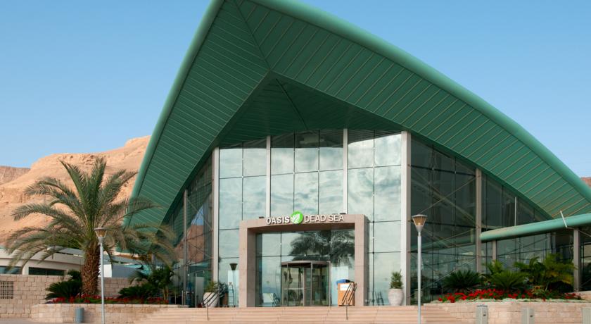
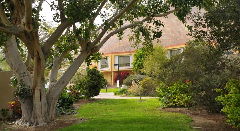
מלון אואזיס ספא קלאב: נווה מדבר שהוא חלום פסטורלי.
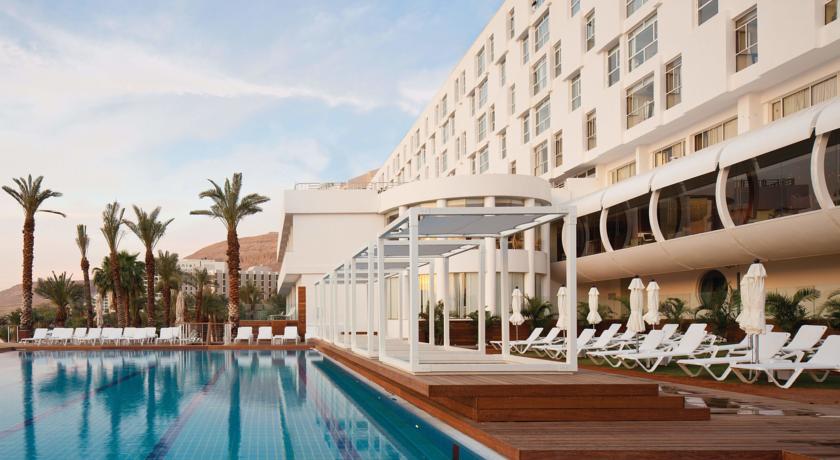
בתוך נווה המדבר האקסקלוסיבי של ים המלח מסתתר לו מלון הטומן בחובו אושר עילאי. העיצוב המיוחד של מלון אואזיס ספא קלאב מדגיש אותו היטב, והמדיניות הייחודית ממשיכה גם בתוך הלובי. ספות בצבעים פסטורליים המכתבים בצורה אידיאלית עם דלפק קבלה חדשני, חלונות זכוכית הצופות לנוף מרהיב ופינות ישיבה מעוצבות יהפכו את החופשה שלכם לחלום. כשתרצו לצאת החוצה וליהנות מהשמש, תגלו שהמעצבים אשר עמלו על אבזור המלון לא דילגו על הבריכה – בה יחכו לכם מיטות שיזוף מפוזרות, חממות צל ומתחם דשא למנוחה מושלמת.
מלון אואזיס ספא קלאב ים המלח שייך לרשת פרימה, ולכן עומד בקריטריונים הגבוהים ביותר הנדרשים מכל מלון המתגאה בשם הרשת. ראשית, כשמו כן הוא: אואזיס הוא נווה מדבר אמיתי, המאפשר פסק זמן מההמולה והריצות של חיי היום יום. לצד מלונות רבים בים המלח, בולט אואזיס בייחודיות שלו. המלון אינו מעוצב באגרסיביות, ובכל נגיעה – הבאה לידי ביטוי החל מהשטיחים ועד התמונות על הקיר – הושקעה מחשבה רבה. מלון אואזיס ספא קלאב, הממוקם באזור מרהיב המשלב מנוחה עם הנאה משלל טיולים במסלולי טבע באזור, מאפשר גם חיבור אידיאלי לטבע של ים המלח.
לא רבים יודעים זאת, אך תייירים מכל העולם מגיעים למלונות מן הסוג הזה רק בשביל זה. עבור ישראלים רבים יופיו של האזור מתקבל כמובן מאליו, אך חופשה מלון אואזיס ספא קלאב מוכיחה כי אין גבול להתפעלות שמציע האזור הנמוך בכדור הארץ. כי בין אם אתם מתכננים ביקור לבד, עם בן הזוג או יחד משפחה, מלון אואזיס ישמח לספק לכם את כל שירותי הבריאות והספא שאתם צריכים בשביל ליהנות מחוויה מלאה. בכל תקופה בשנה, ים המלח שומר על מעמדו כיעד תיירות מספר אחד הן עבור ישראלים והן עבור תיירים זרים, וכעת הגיע הזמן לנצל את ההטבות וליהנות מימים של שקט, מנוחה ורגיעה מוחלטת.